︎Hi, my name is Jae Jeon, I am a graphic designer based in San Francisco. My work pays strong attention to research and the experimentation processes. My practice revolves mainly around multidisciplinary design such as textural design, publication, typography, package, motion / 3D and digital experience. As a designer, I’d like to share and communicate around things I like as contemporary art, music, fashion, spacial experience, technology, sciences, and many other things.
01. EXPERIENCE: APPLE, CULDESAC STUDIO, LANDSCAPE, MONIKER SF, PLAY, MANUAL CREATIVE
02. DISCIPLINES: ART DIRECTION, BRANDING, EDITORIAL DESIGN, PACKAGE DESIGN, MOTION / ANIMATION, 3D GRAPHIC, DIGITAL EXPERIENCE
03. INTERESTS: IT IS REALY HARD TO TELL EVERYTHING THAT I LOVE. IF YOU ARE INTERESTED IN MY FAVORITES —> (WORK IN PROGRESS)

TITLE:
AJI KIJI
CATEGORY: BRANDING, INTERIOR DESIGN, PACKAGE DESIGN, WEB, PHOTOGRAPHY
2024-2025
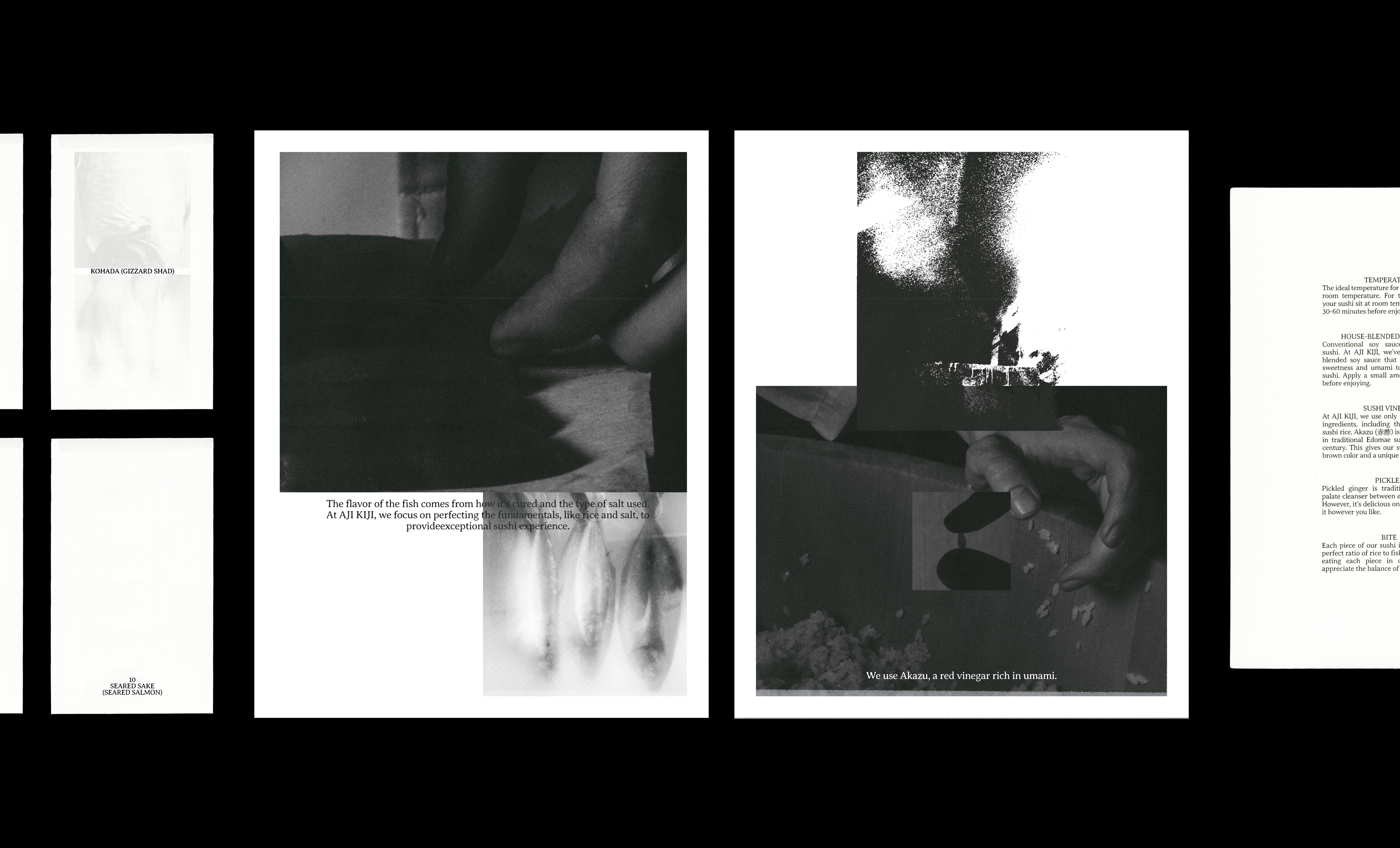
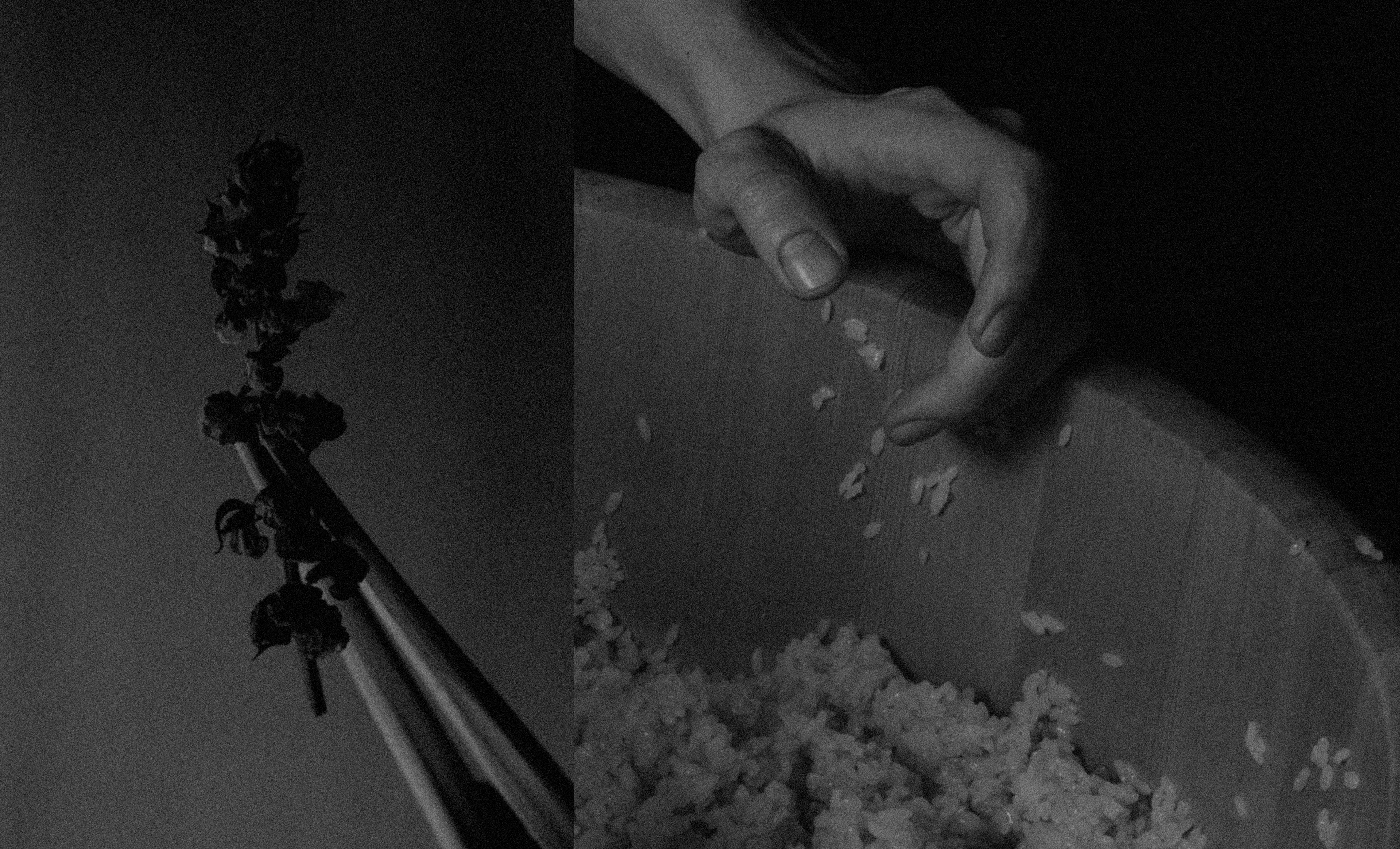
AJI KIJI reimagines takeout sushi by delivering omakase-level quality in a seamless, elevated format. To bring this vision to life, I crafted a cohesive brand experience across key touchpoints—branding, interior design, packaging, and printed materials.
Every detail was designed to evoke refinement and elevate the dining experience, from the store ambiance to the tactile feel of the packaging. This holistic approach sets AJI KIJI apart, ensuring a visually and emotionally engaging takeout experience.
Every detail was designed to evoke refinement and elevate the dining experience, from the store ambiance to the tactile feel of the packaging. This holistic approach sets AJI KIJI apart, ensuring a visually and emotionally engaging takeout experience.
CLICK TO SLIDE
︎︎︎


TITLE:
FADE GROTESK
CATEGORY: PROMPT-BASED TYPE DESIGN, EDITORIAL DESIGN
2025-
Fade Grotesk intentionally disrupts the clear, stable system characteristic of modernist typography, questioning design conventions that have long pursued perfection and permanence. Treating AI as a 'computational partner' rather than a mere automation tool, the project visualizes the dissolution of letterforms into abstract traces through a meticulously controlled, nine-stage system of points. Through this process, the designer's role shifts from physically constructing form to actively 'curating its erosion'. Ultimately, the work highlights the beauty of incompleteness that emerges as legibility collapses, exploring the lingering presence of text at the intersection of recording and erasing.
!!! MORE IS COMING !!!
︎︎︎


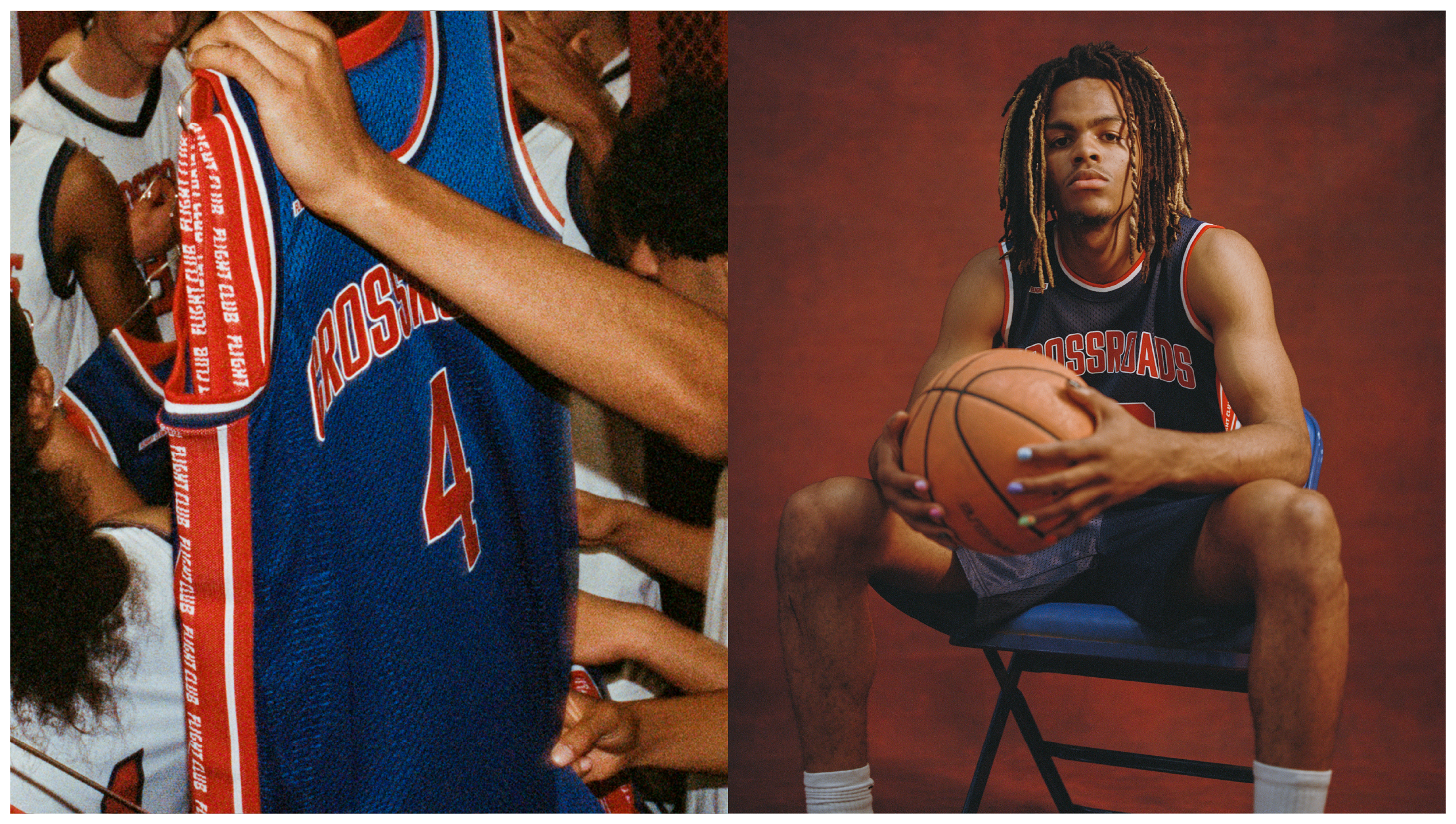
TITLE:
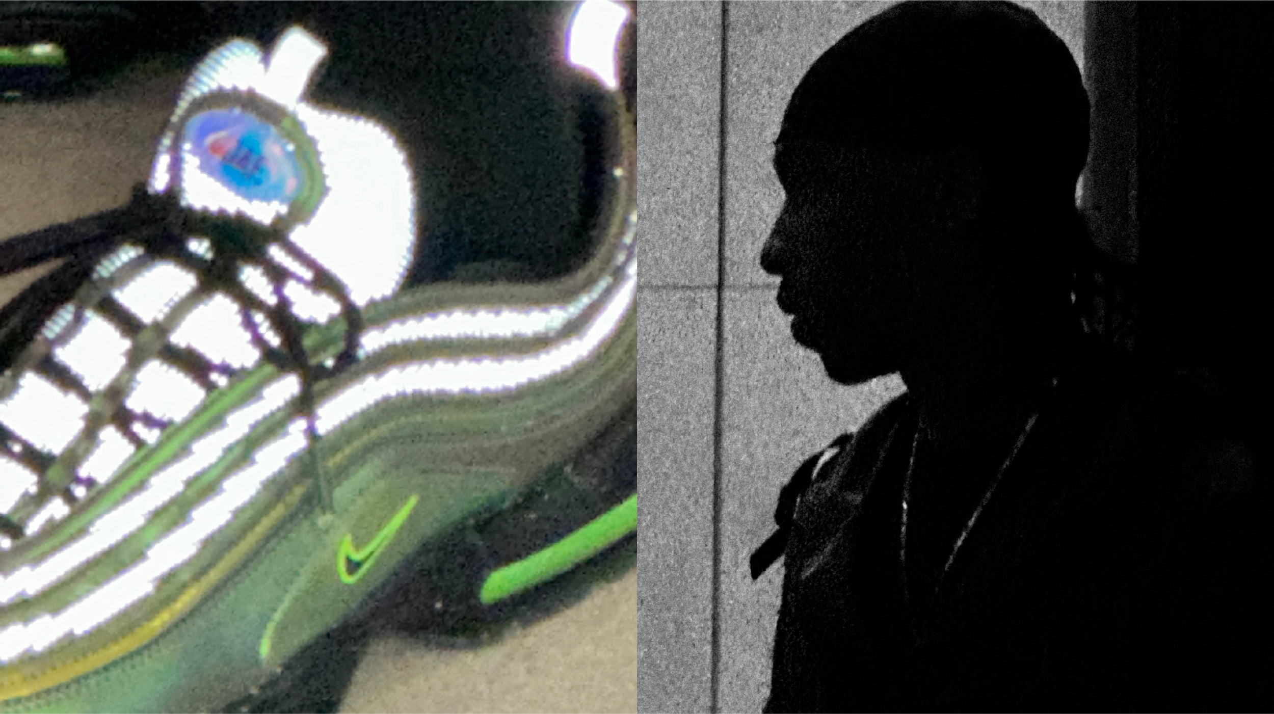
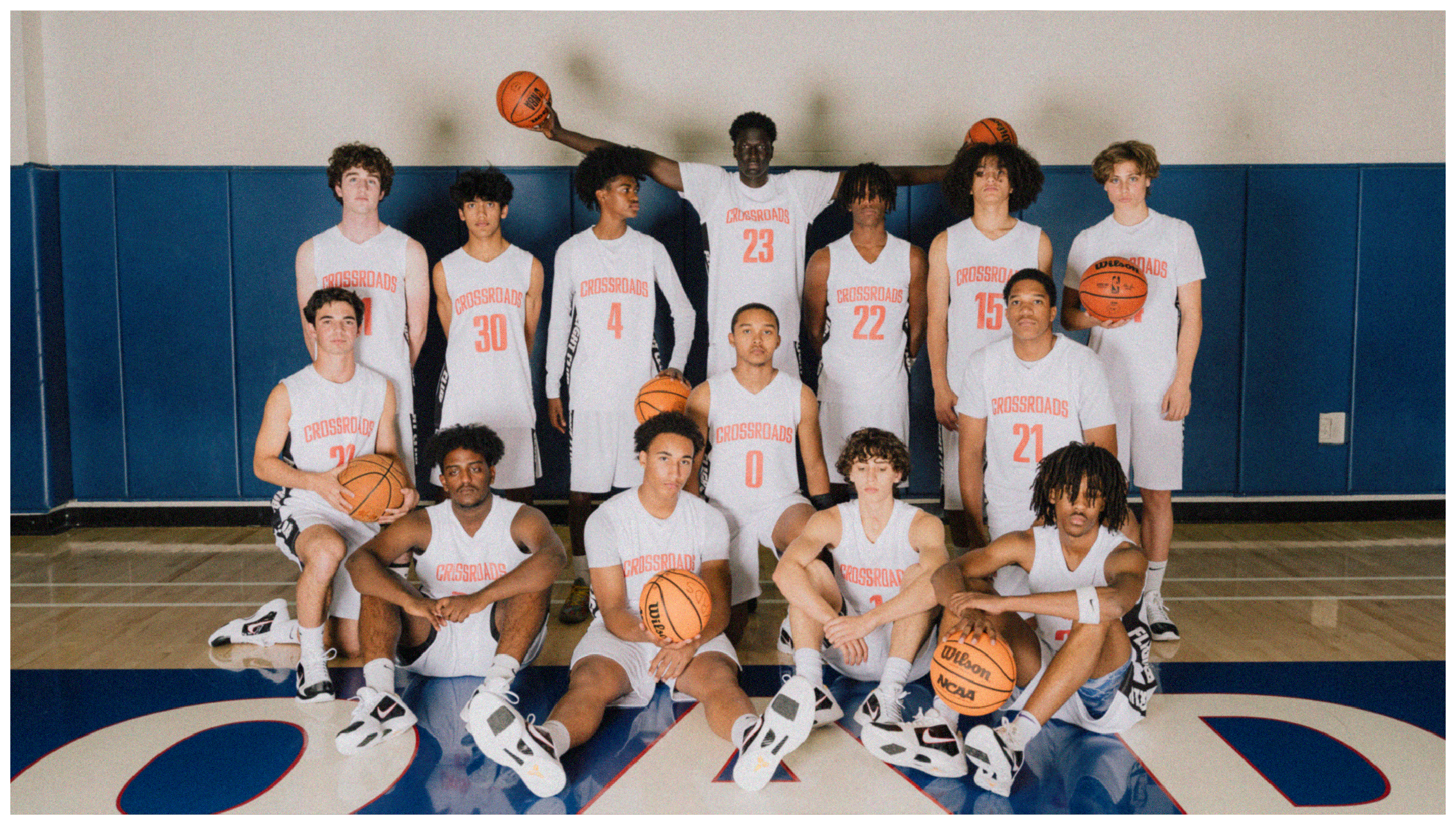
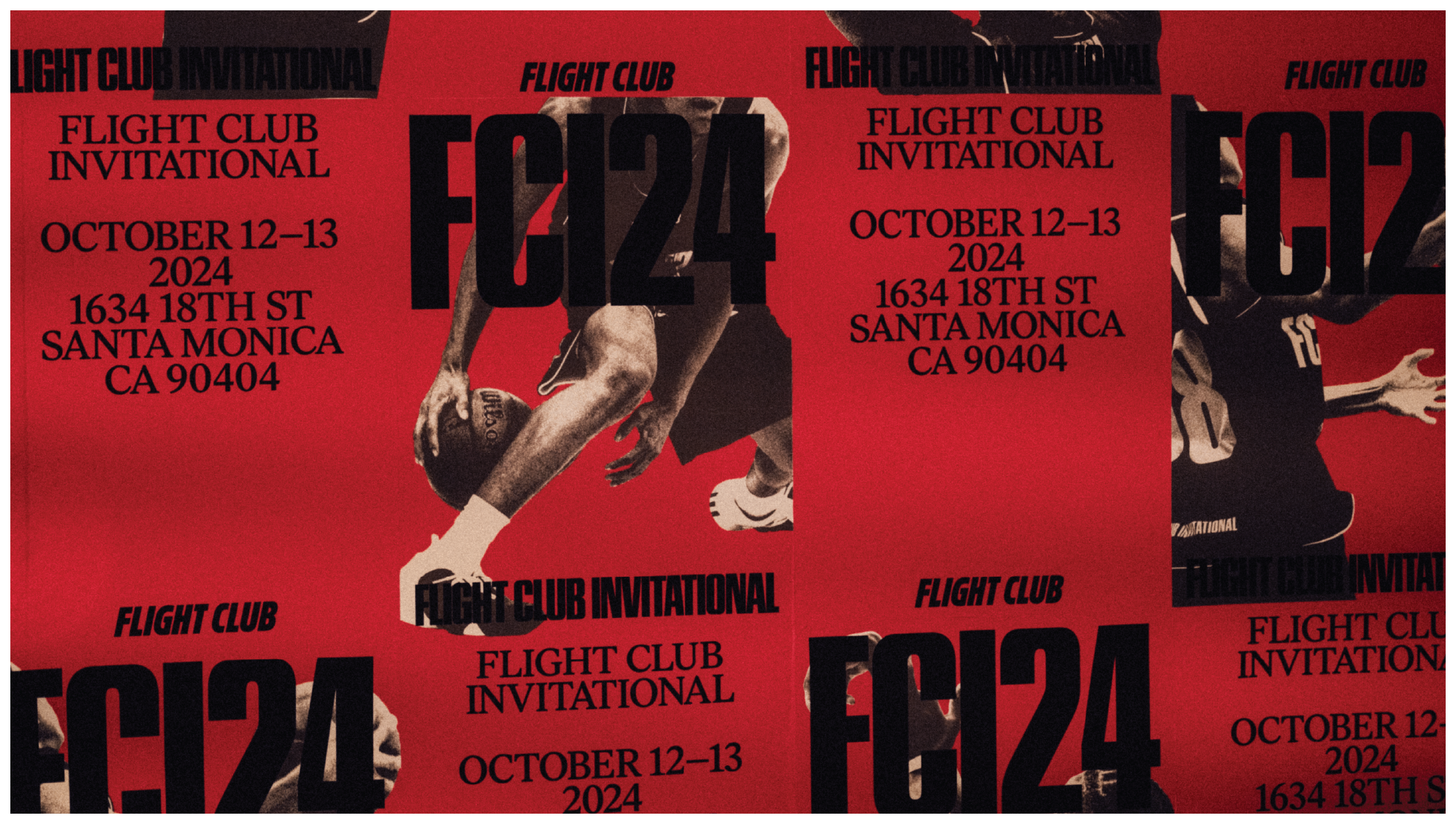
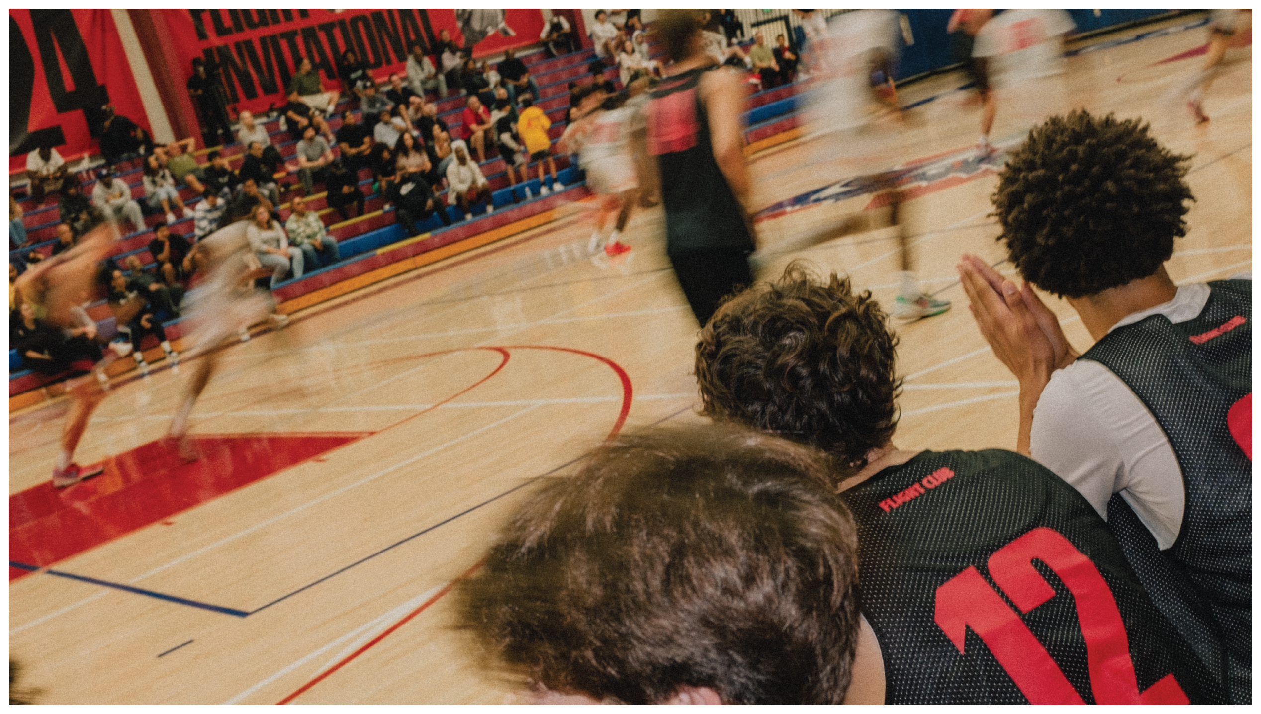
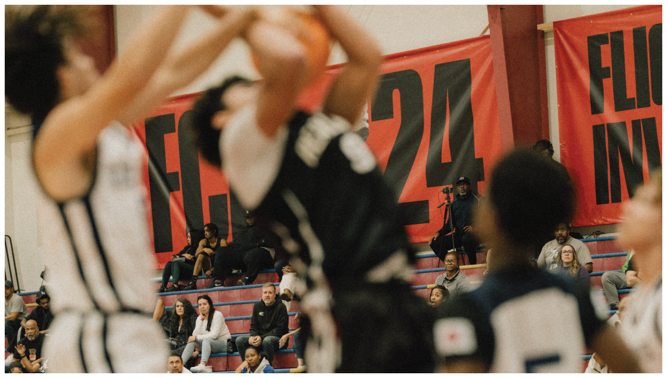
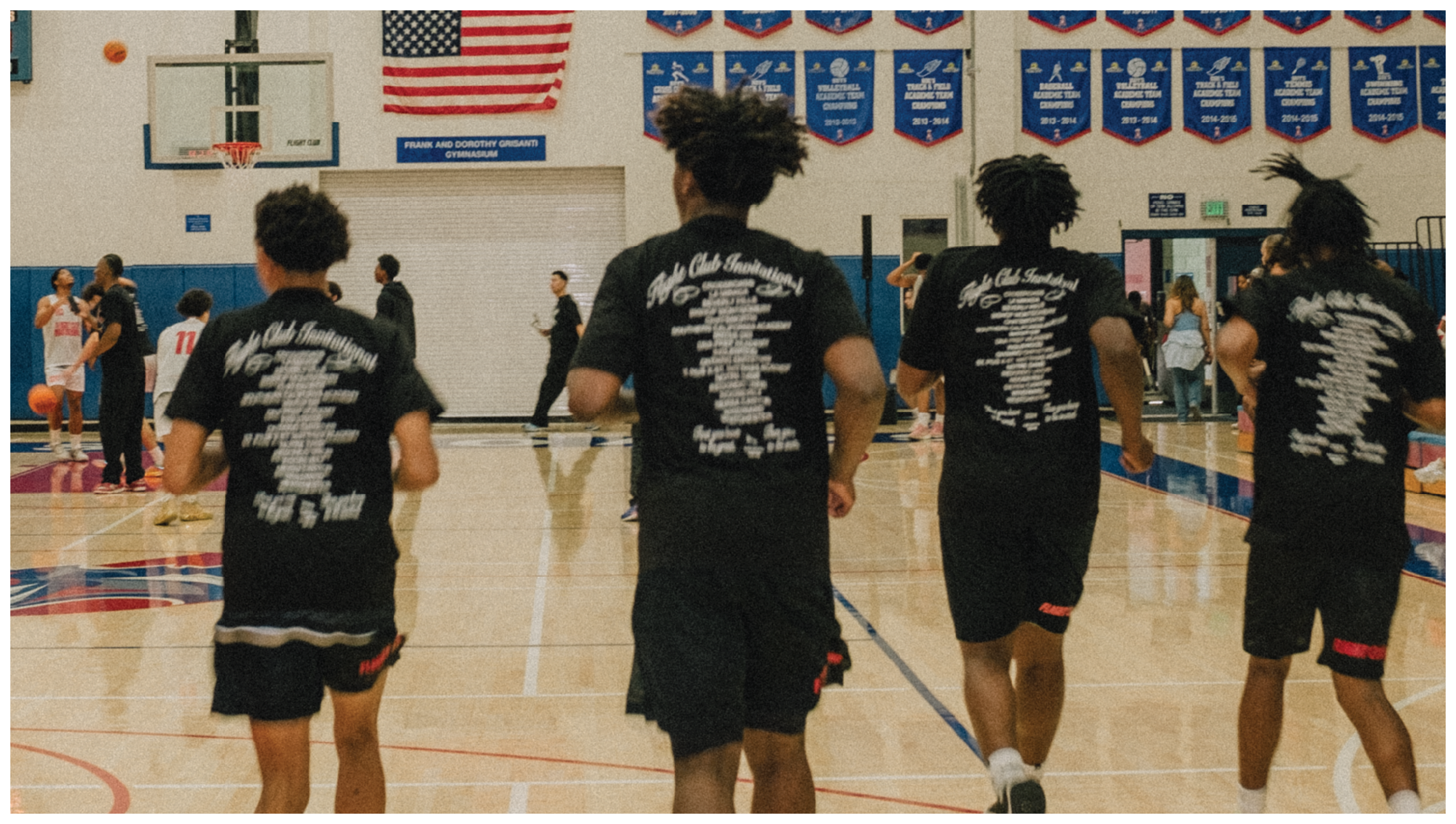
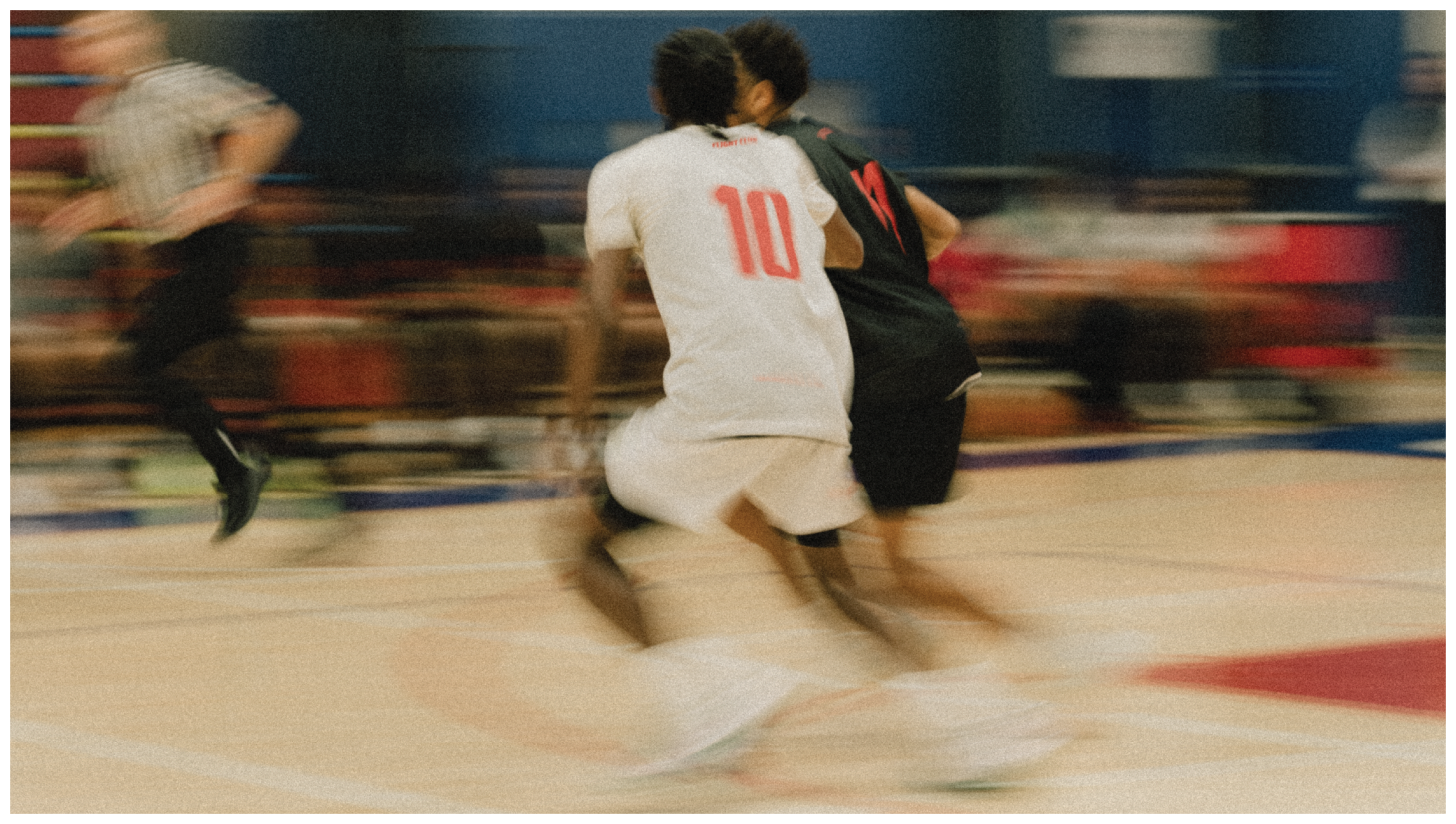
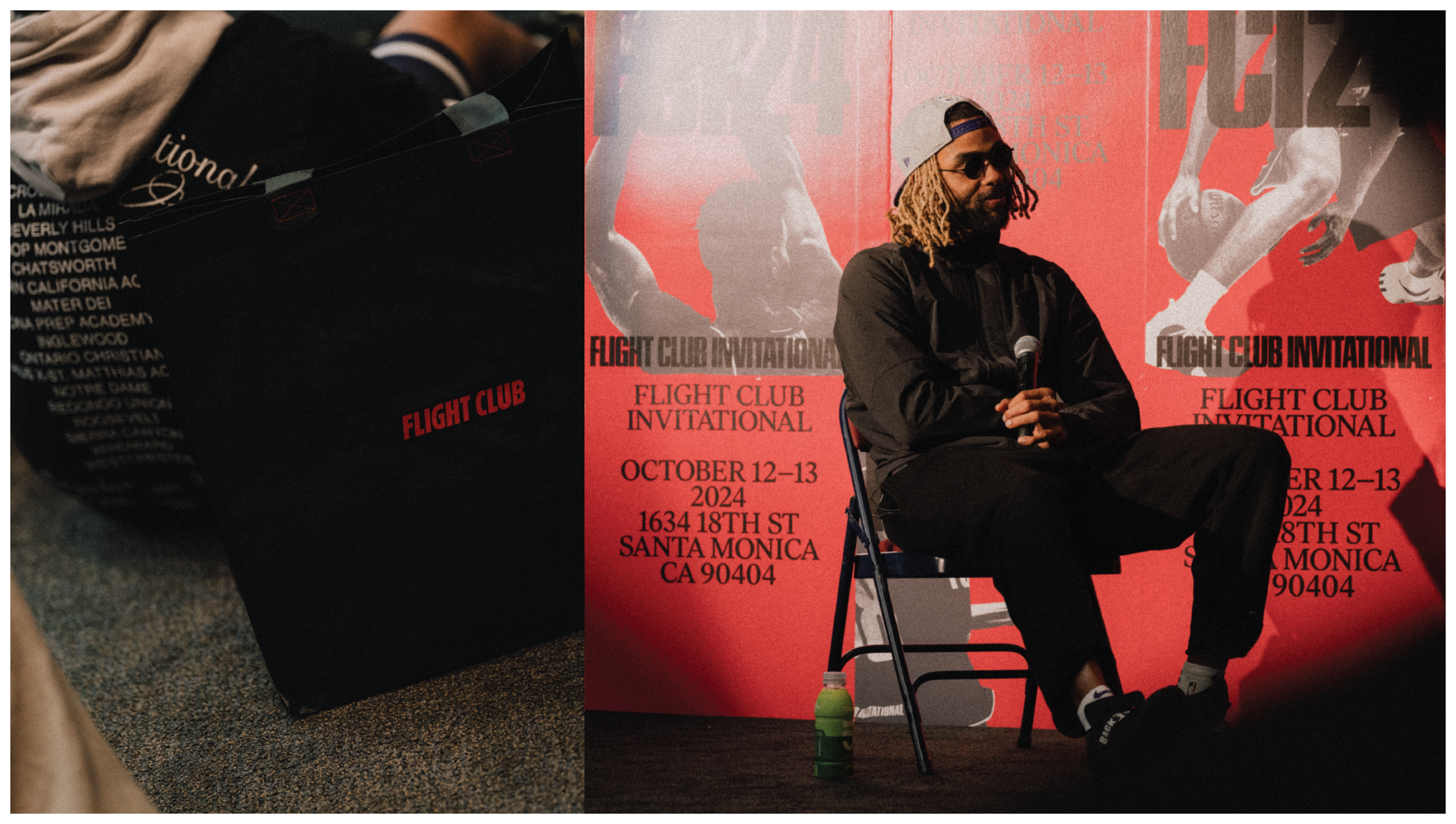
FLIGHT CLUB INVITATIONAL 2024
CATEGORY: ART DIRECTION, BRANDING, WEB, SPACIAL DESIGN, MERCH
2024
Back for its second year, Flight Club Invitational 2024 showcased the very best of California teams, becoming a part of the legacy and known story of how high-caliber, top-tier basketball players are born, raised, and trained in Southern California. For this project, I aimed to evolve the overall brand direction, elevating athletic apparel and uniform design, and creating meaningful content and experience with participating players.
CLICK TO SLIDE
︎︎︎


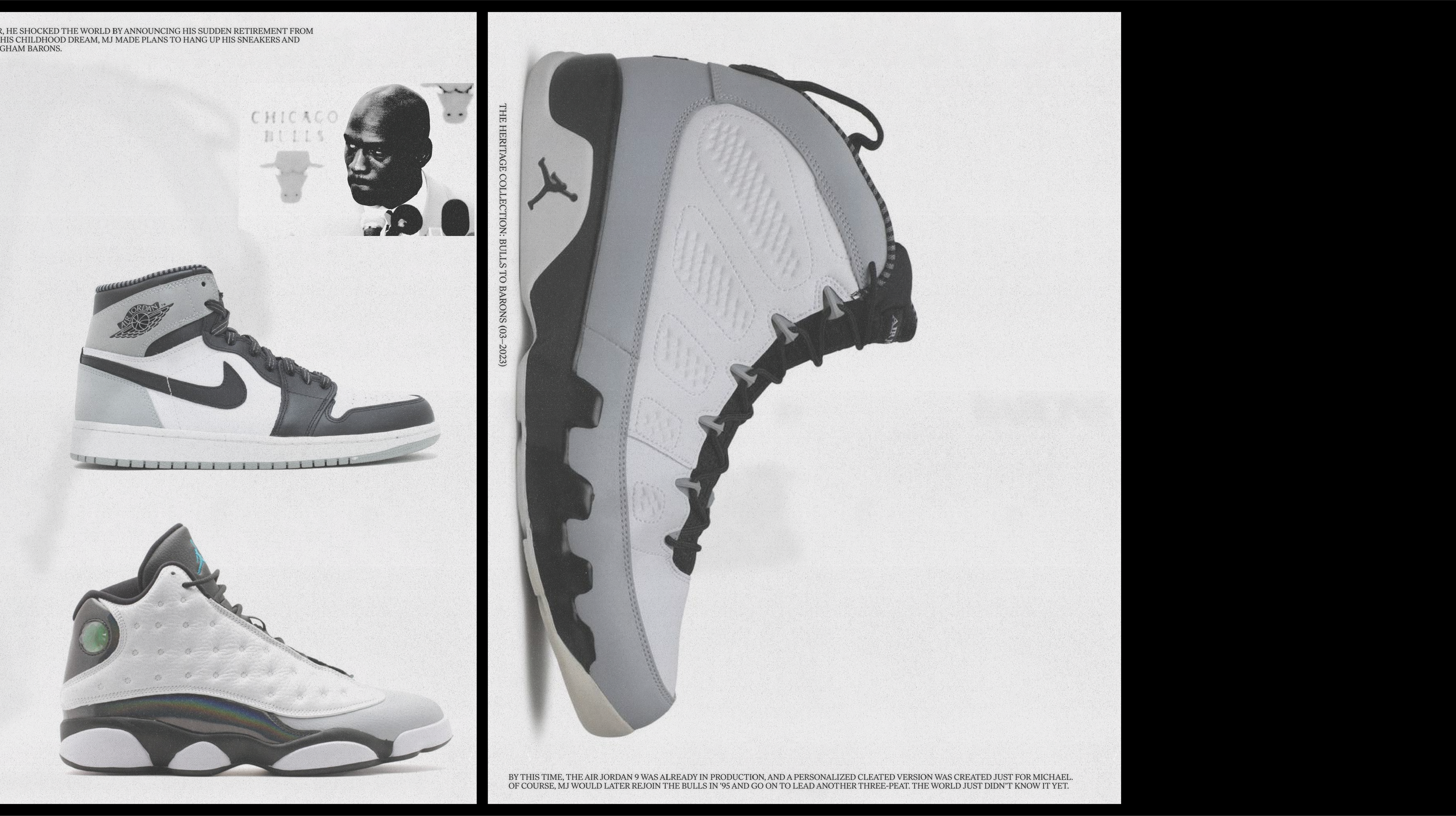
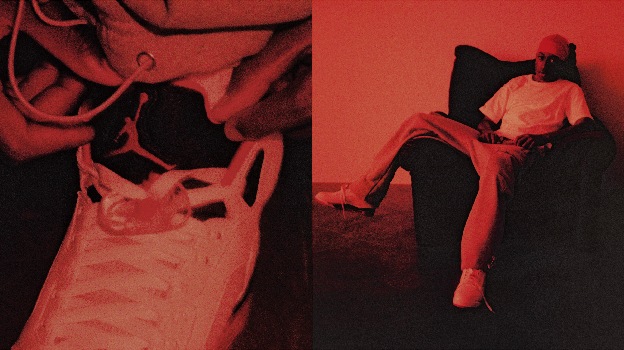
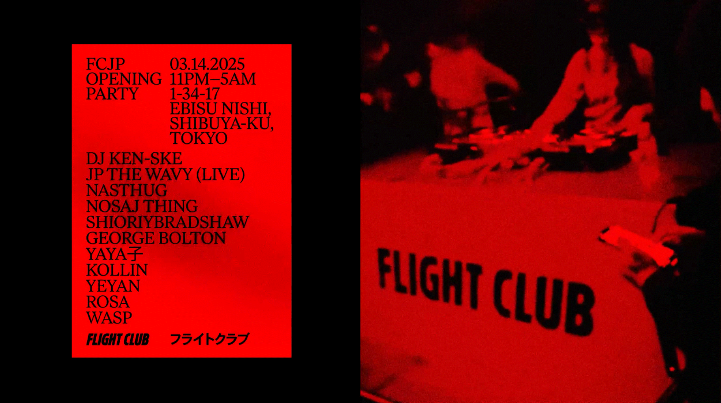
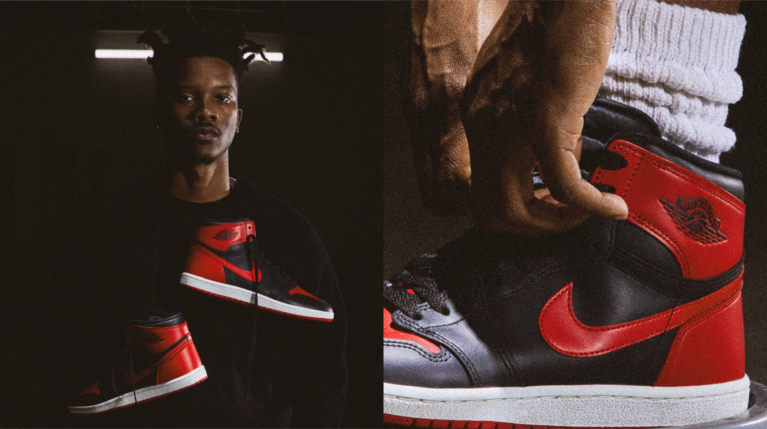
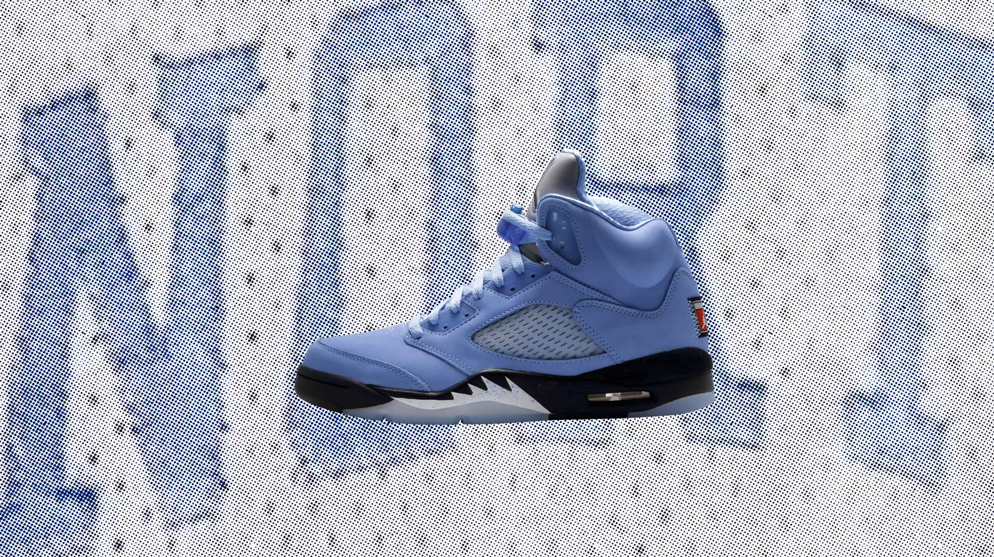
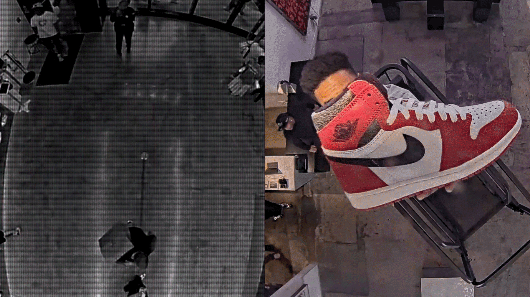
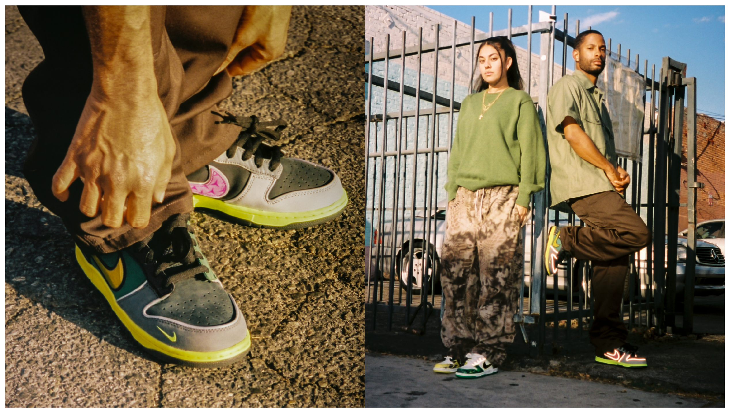
TITLE:
FLIGHT CLUB
CATEGORY: DESIGN DIRECTION, BRANDING, PHOTOGRAPHY DIREECTION, TYPOGRAPHY, MERCH
2023-2025
At Flight Club, I took on a versatile role across branding, editorial design, photography, design direction, exceptional execution, and merchandise. Partnering with the content team, I not only elevated the quality of creative across channels but also expanded the brand’s visual territory—shaping how Flight Club communicates culture to its audience.
CLICK TO SLIDE
︎︎︎